Also, releasing the new helmet on NFLN should've been another clue that not much change was coming -- if you overlooked the "enhanced" word use. Otherwise, they would've done it at One Buc Place. Like they're doing with the unis. I expect the uniforms to be much different. I think we'll finally ditch the dark gray pants that look so bad by the middle of the 1st quarter.
Well any backlash they get is well deserved imo. You don't create an event with a 3 day build up, on NFL Network when the new look hardly looks new. If they would have just called a press conference and released it one day as a surprise with no build up....I think it would have gotten a better reception. They built up expectations so high that it would have been hard to meet them, and then showed us a product that made many say "meh" Releasing it without the full uniform seems like a stupid mistake too. Seeing the entire package would have provided much more boom for the buck. Combine that with the initial release pics making it appear black and coming out on the internet 30 minutes before the NFL Network reveal.....and I'd say somebody in advertising needs to be fired. They really blew what should have been a very positive change.
Releasing it before the new unis is dumb. Agreed.But the only reason people are disappointed is because they overlooked the word "enhanced" used by the Buccaneers in their release announcing the changes coming. The Bucs never used the word "new" prior to this.
I don't know about that. Most people I see that are unhappy with it, didn't expect anything but a new updated flag logo. They just aren't happy with the way it looks. I don't think many people really expected an entirely new logo.
JDouble: With all due respect, you can really look at the two logos side by side and say the old one is better? Really?And judging by the polls results, almost 2/3 of the fans who voted LIKE the new logo.
Well any backlash they get is well deserved imo. You don't create an event with a 3 day build up, on NFL Network when the new look hardly looks new. If they would have just called a press conference and released it one day as a surprise with no build up....I think it would have gotten a better reception. They built up expectations so high that it would have been hard to meet them, and then showed us a product that made many say "meh" Releasing it without the full uniform seems like a stupid mistake too. Seeing the entire package would have provided much more boom for the buck. Combine that with the initial release pics making it appear black and coming out on the internet 30 minutes before the NFL Network reveal.....and I'd say somebody in advertising needs to be fired. They really blew what should have been a very positive change.
how is it not a "very positive change" The most critical fans they have -- all over these boards -- are liking the change, right? Also, you don't roll out a brand change like you're describing. For days people have been discussing the Bucs, they got national exposure too . . . and we're all still talking . . most of it very positive . . . a few months ago was Freeman, MRSA etc. . . . all gone now
The color is better. The skull is better. The cheesy shading is gone. The come-over is gone.The sword handles are better. The sword blades are better. The football is better. The silver is an upgrade over the gray.
Disagree. Love the older red (looks more like blood). Completely agree with whoever said the new logo just looks like pieces of clip art piled together.
I think once the helmet and jersey are put together and we wear it out on the field, people will fall in love with it.
I can tell you one thing, most fans are not dissecting shadows etc. This board is filled with "elite" fans.
It's... compensating.
Can someone put up the front view of both the old and new helmets?I think our opponents get a completely different view now.I like the front view (facing) on the new helmet.
Having an artistic eye and opinion = elite?
Can someone put up the front view of both the old and new helmets?I think our opponents get a completely different view now.I like the front view (facing) on the new helmet.
New helmet: New helmet:
 New helmet:
 Old helmet:
 Old helmet:
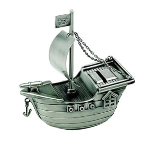
 Pewter pirate ship:
SOOOOO much better (and aggressive.)Opponents will not forget who they're playing this season - especially on Defense.Love it.
Man that red is REALLY bright. So curious what the unis will look like. Silver and bright red? Should be interesting!
Having an artistic eye and opinion = elite?
No, I meant (as a compliment) that the fans on these boards are unlike the rank and file, they are much more invested and so they scrutinize things much more than others. Again, meant as a compliment because people on the board who are definitely hard core loyal fans
Overall it looks good. I just don't like the bulbous cranium of the weird looking skull. It's shaped like that typical ghostly alien head.

