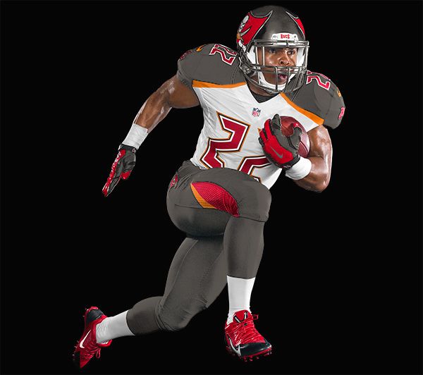
McCoy posted on his twitter account that they also have white pants and that they have 4 different sock colors. I don't like them better but I like the look of them and the orange has to be there. I would have preferred the old font and use the numbers from the old font the way they use to on the practice jerseys.
McCoy posted on his twitter account that they also have white pants and that they have 4 different sock colors. I don't like them better but I like the look of them and the orange has to be there. I would have preferred the old font and use the numbers from the old font the way they use to on the practice jerseys.
Taking out the orange does look better. I think it also looks better if you extend the orange band so that it runs along the entire border of the white and pewter. I also took out the lines going through the numbers.
I actually really agree with you about extending the orange... Looks good.
Taking out the orange does look better. I think it also looks better if you extend the orange band so that it runs along the entire border of the white and pewter. I also took out the lines going through the numbers.
I actually really agree with you about extending the orange... Looks good.
Taking out the orange does look better. I think it also looks better if you extend the orange band so that it runs along the entire border of the white and pewter. I also took out the lines going through the numbers.
I actually really agree with you about extending the orange... Looks good.
Taking out the orange does look better. I think it also looks better if you extend the orange band so that it runs along the entire border of the white and pewter. I also took out the lines going through the numbers.
I actually really agree with you about extending the orange... Looks good.
Take out the orange.
I rest my case.
Looks great, but when we play Atlanta its gonna suck.
Take out the orange.
I rest my case.
Looks great, but when we play Atlanta its gonna suck.
Take out the orange.
I rest my case.
Looks great, but when we play Atlanta its gonna suck.
Take out the orange.
I rest my case.
Looks great, but when we play Atlanta its gonna suck.
Needs MORE ORANGE
Needs MORE ORANGE
Needs MORE ORANGE
Needs MORE ORANGE
Taking out the orange does look better. I think it also looks better if you extend the orange band so that it runs along the entire border of the white and pewter. I also took out the lines going through the numbers.
Big fan of this.Replacing the red with orange is too typical. Black and red. Grey and red.Bucs are pewter, red, and orange.

