uhhhhh
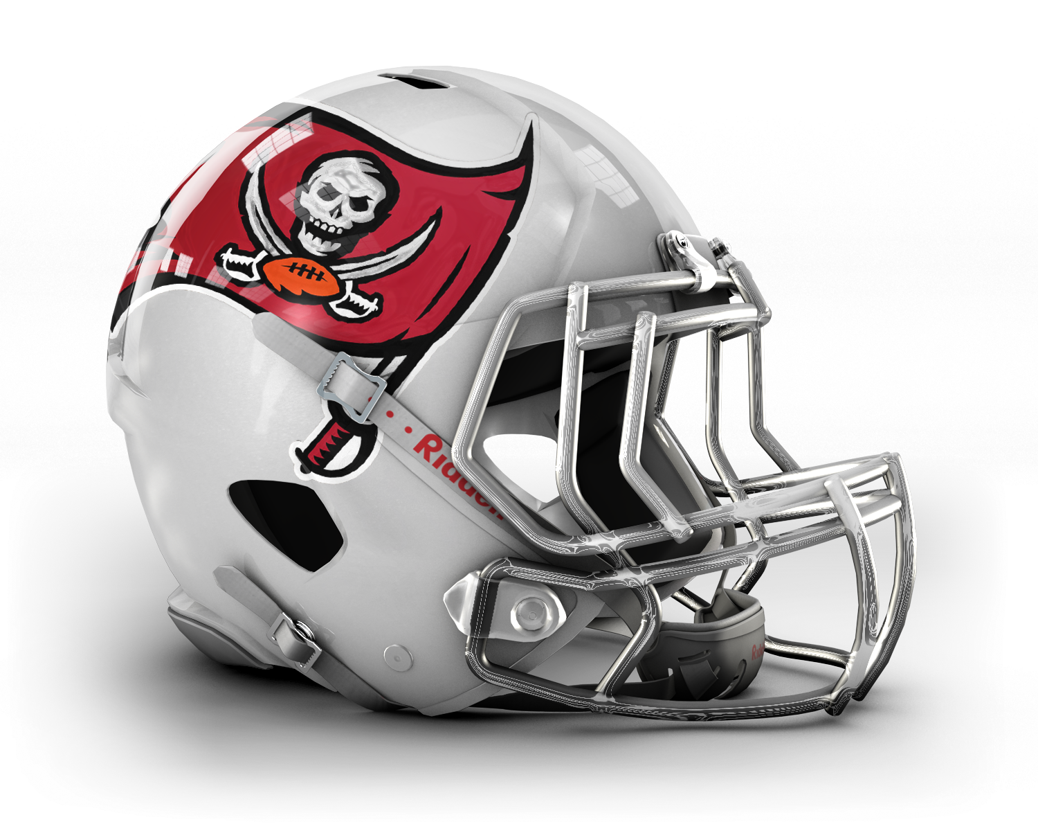
Where did that come fromI dont hate it, but its too close to the Cards for my tastes. We need to stay away from pure white and red IMO. Silver/Chrome/REALpewter all the way.
sorry dude, that's official.#mahsources
uhhhhh
Where did that come fromI dont hate it, but its too close to the Cards for my tastes. We need to stay away from pure white and red IMO. Silver/Chrome/REALpewter all the way.
sorry dude, that's official.#mahsources
jk
They look good but neither strike me as #FIRE. I'm expecting more be done to the helmets than some think. The flag in these 2 should be more centered as well.
LOL.....Awesome. #Fire !!I wish this would happen just to watch Jdud's meltdown.
lmao!!
uhhhhh
:OBut in grey/matte grey/pewter please!Looks just like the Cardinals helm if not.
fine.
Very clean but I think the new one will have more details :D
How is that any different from the current helmet? Outside of the chrome face mask.....it is identical no?
LOL.....Awesome. #Fire !!I wish this would happen just to watch Jdud's meltdown.
Wouldn't that be awesome if McCoy & Sapp brought out a dud like this-- just to F with people? ;D
FASHION FASHION FASHION
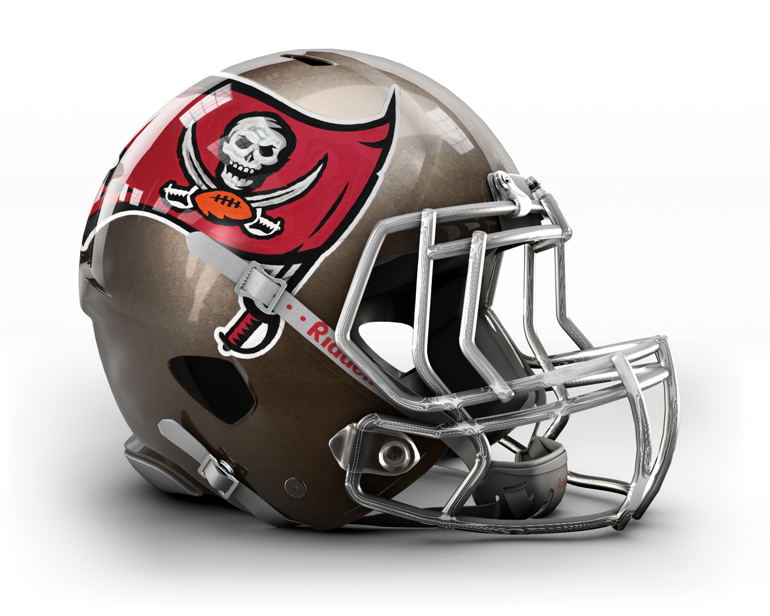
How is that any different from the current helmet? Outside of the chrome face mask.....it is identical no?
Looks bigger... and some "enhancements" to the skull and swords.
GO BOLD, Bucs!!! GO BOLD!!!!
Go Bold or Go home . I agree.
How is that any different from the current helmet? Outside of the chrome face mask.....it is identical no?
Just saw those posted in a thread created at some site that is ALL about sport logos. talk about no life!It's not very diff at all… just wanted to make some people squirm as much as I did when I saw the white version, which is why I posted it here.I've been wrong before, plenty of times, but my final calls are:Updated, cleaner version of current logo.Largely placed on the helmetWhite helmet base, but white is actually an accent color under decalLarge decal with large NEW (improved logo)Chrome grill#firebtw "fire" is the equivalent of me calling something "sick". If someone showed me the new helmet and I loved it, I'd call it "sick". I don't use words like "fire", that's for Lloyd Banks.So if I said the helmet looked "sick", would you guys start saying it's pukey green or has some other diarrhea like qualities associated with it?
What I like most is how the black meets the white in perfect harmony to create a vortex of heaven on a NFL helmet. The only thing that comes to mind when I think of this is if Chuck Norris were a color, it would be this combination of colors/shade combined. The font used for our new logo is exquisite, I cannot quite put my mind on it. Is it Arial or Tahoma? I had long pondered and feared they might use Verdana, and I loath Verdana. I'm quite happy to see such a unique, breathtaking, modern font used. I can certainly tell that ownership is sending a message to the fans that they are winners. I was also concerned they were going to move away from all caps and I just don't think that embodies what being a Buccaneer is truly about. When you say our name, you should shout it like King Leonidas trying to sing a cover of Adele's Rolling in the Deep. The black stripe at the top of the helmet says, "I don't know what I am having to drink tonight, but I'm going to have a lot of whatever it is." ... and to me, that just echoes exactly what I want as a fan. I also think it was clever to make the chin strap white, but instead of the chin strap covering the logo and being all white, it is partially black in one spot so that it doesn't overlay the Bucs logo. Either that, or they have just placed a giant "BUCS" logo over the chin strap, which would probably prevent players from ever taking their helmet off in the first place. If the later is choice, I say Well Played. If I owned a Picasso, I would probably take it off the wall and nail this up it's place. There are few works of art that can truly hit the hearts of their fans like this, 5 out of 5 stars.Sincerely,Curt (3SK)
How is that any different from the current helmet? Outside of the chrome face mask.....it is identical no?
Just saw those posted in a thread created at some site that is ALL about sport logos. talk about no life!It's not very diff at all… just wanted to make some people squirm as much as I did when I saw the white version, which is why I posted it here.I've been wrong before, plenty of times, but my final calls are:Updated, cleaner version of current logo.Largely placed on the helmetWhite helmet base,Large decal with large NEW (improved logo)Chrome grill#firebtw "fire" is the equivalent of me calling something "sick". If someone showed me the new helmet and I loved it, I'd call it "sick". I don't use words like "fire", that's for Lloyd Banks.So if I said the helmet looked "sick", would you guys start saying it's pukey green or has some other diarrhea like qualities associated with it?
THERE'S NO WAY N HELL THE BUCS ARE BARELY TWEAKING THE HELMET, imo.That helmet isn't worth hijacking a Network!!!!!!!
