Not too bad!
Maybe it was the lighting, The Grill didn't seem all that Chrome, Kind of light gray....
Nah, it was chrome, showed up nice in HD. I like the face mask, not so much the huge flag logo....
More aggressive, on TV its much brighter under the lights... I like it. Just the right amount of change.
Orange ship, flag is actually the sail. Should be that way.
I still think the facemask shoulda been black or the helmet shoulda been darker to offset the chrome,
Wonder how much they paid a designer to copy a saturday morning cartoon from 1986? HAHAhaha!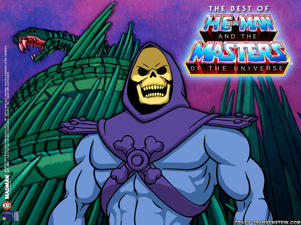
For those who hate it, If you walk away for 15 minutes and then look back at the new logo you won't even be able the difference lol
I love it. How old are all of you people complaining? Anyone under the age of 30?
My boss...the ball busting philly fan texted me:"I do like the size of the logo. It's very urban. I would leave the tags on mine."SMH
For the doubters, give it time to grow on you. I like it!
That helmet is awesome!!
My guess is all below 30... But I'm old.
Wonder how much they paid a designer to copy a saturday morning cartoon from 1986? HAHAhaha!
+1You can't see the skull from a distance as the outline is too thin.Bad design is bad.
Like the helmet. Don't like the new ship (I really liked the old one). Hate the new logo font. Hate it. The helmet is pretty cool, though.
Wonder how much they paid a designer to copy a saturday morning cartoon from 1986? HAHAhaha!
+1You can't see the skull from a distance as the outline is too thin.Bad design is bad.
The old skull looks exactly the same.
