The helmet's starting to grow on me a bit. However, the only issue I have is with the skull. It looks like it has a unibrow.
The design is fine...I'm intrigued to see how they'll match up with the new uniforms now.
Here is an actual pewter pirate ship: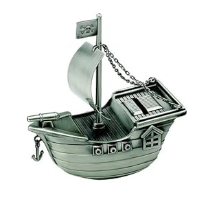 Here is the new helmet:
 Here is the old helmet:
 I feel like the new color is much closer to real pewter than the old one was.
My only hope/concern for the new uniforms is that the pewter, on the uniform itself, actually looks like pewter. Not that crappy brownish "pewter."
It is indeed. Gonna be really interesting to see how the new unis play off the lighter silvery pewter and the brighter red.I have a feeling the new unis will make the helmets look better than they do on their own.
Here is an actual pewter pirate ship:
Yes the helmet color is a definite improvement
In those two photos the helmet color looks identical to me.Sure hope the unis have grey and silver.....and no brown.
Just spruced up the new logo to show that it could have easily been a little less generic.
Starts reminding of the Raiders with the eye patch.
Just spruced up the new logo to show that it could have easily been a little less generic.
Starts reminding of the Raiders with the eye patch.
Yeah I have gotten a lot of that. personally I don't see it. I mean, most skulls in pirate flags have an eye patch...so it's not like that is a Raider trade mark thing. Besides that, the raiders logo is a man in a football helmet in black and silver. Very different from a skull on a red flag imo....but like I said, I have had a lot of people say it's too Raiders. Just shows everyone sees things though their own lense I suppose.

Yeah. I'm not so sure the pewter changed at all. It has always looked very different depending on the lighting, and I think that is what causes the confusion...but the more pics I see, the more I think it stayed the same. The top left pic shows perfectly how one light can make it look grey while another makes it look brownish. The two glares are different hues.
We are gonna see a lot of torn decals in the front. Same color except for the hand painted dark areas. Still love it
I love it and the more and more I see it the more I love it.I've been wanting a bigger, more aggressive logo for awhile now and that chrome facemask makes it. Really sets it off.Now...to improve those AWFUL brown-looking "pewter" pants...
I like the ship and helmet more the next day...
if they had added any black accents at all, like the little line going up the blade of the sword in the flag in the old logo and maybe added a small tear somewhere along the back end of the flag it would have looked 10x better…theres too much red space, it makes the skull stand out so much …probably did that on purpose to look "fierce" or some shi
