A new Pewter Report Roundtable debuts every Tuesday on PewterReport.com. Each week, the Pewter Reporters tackle another tough Bucs question. This week’s prompt: With the Bucs unveiling their new alternate throwbacks, which Tampa Bay uniform combination is your favorite?
Scott Reynolds: There’s Just Something About Bucs’ All-Pewter Look
I am a big fan of the Bucs’ classic uniform look, and no, I’m not talking about the Bucco Bruce throwback uniforms. I think the creamsicle look is cool and I appreciate the team wearing it once a year (or a few times like this season as the team has dusted off the original all-white Bucco Bruce uniforms of 1976, too). But to me the throwback look reminds me the Bucs’ losing ways from 1976-96 when the franchise had 18 losing seasons and just three years with a winning record and playoff appearances. It’s interesting that no one on the Pewter Report staff picked the creamsicle look.

Former Bucs C Ryan Jensen and QB Tom Brady – Photo by: Cliff Welch/PR
So I prefer Tampa Bay’s red-on-pewter on white-on-pewter look that the Bucs have worn while winning eight division championships and two Super Bowls from 1997-2024. But not the boring, vanilla white-on-white uniform combo that the team opts for in early September games at home. The team’s primary colors are red and pewter – not white. And I don’t think wearing white pants at home on a hot day really makes a difference in the Florida heat and sun, either.
My favorite Bucs’ jersey combo is one that the team has worn just a handful of times – the alternate pewter jerseys with the pewter pants. Pewter is the Bucs’ unique color. While the Raiders and Lions wear silver and the 49ers and Saints wear gold, only Tampa Bay wears pewter, and I think that’s cool. The uniqueness of the color and the fact that it is proprietary to the Buccaneers is a big reason why I renamed our company Pewter Report from Buccaneer Magazine after our sub-license agreement with the team regarding the name “Buccaneer” ended.
Perhaps I’m enamored with them because it’s a rare look, as the Bucs have only worn their alternate pewter jerseys six times since they debuted in 2020. Three of those occasions occurred in the 2020 season and the team didn’t wear them last year. Hopefully the pewter-on-pewter look returns for at least one game this season. To me it’s a bad ass look, and I’m glad the franchise opted for an all-pewter alternate rather than a trendy black alternate jersey. The white numbers with the red trim just pop off the pewter jerseys.
Matt Matera: Bucs’ Red Jersey With White Pants Shines More
When you think of the Bucs you think of the team’s red jerseys. Tampa Bay fans are constantly angry as the Bucs don’t wear their red jerseys until later in the year – typically November – but it makes sense when playing in the hot sun at Raymond James Stadium early in the season. So when the Bucs combine their red jerseys with the white pants, they still get the temperature advantage with a little more shine to their look.
The white pants makes the red jersey and pewter helmet go off even more. It makes the red look slightly brighter, thus more aesthetically pleasing. Every team has a white jersey, so that doesn’t make Tampa Bay’s road uniform anything special. But the white pants accentuates the red jerseys even greater than expected.

Bucs QB Baker Mayfield – Photo by: USA Today
Adding the red stripe along the white pants gives it a little more of a red on red look. Tampa Bay has worn this under the bright lights of primetime football, such as early-season Monday Night Football games, making it even more fashionable. These are the top level uniforms that the Bucs have in my opinion.
Bailey Adams: Red Jersey, Pewter Pants Just Feels Like The Bucs’ Look
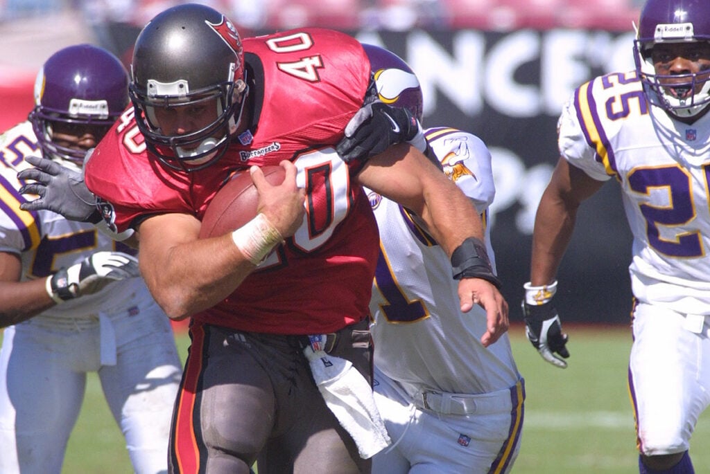
Having grown up in Tampa, I’ve been watching Bucs games for as long as I can remember. And perhaps it’s the fact that I’ve watched the 2002 America’s Game roughly 600 times (and counting) in my life, but when I think about the Bucs look, I think pewter helmet, red jersey, pewter pants. That’s the classic look and my favorite, though I do think Tampa Bay’s uniform design and its set as a whole are pretty underrated nationally.
Former Bucs FB Mike Alstott – Photo by: Cliff Welch/PR
The creamsicles are obviously a popular look throughout the football world. In fact, I think they may be even more popular nationally than they are within the Bucs fan base, as they tend to be pretty divisive with the Tampa Bay faithful. And as much as I do love the creamsicle look and Bucco Bruce logo, I think the red and pewter rebrand turned out to be a stroke of genius in 1997.
The color scheme lends itself to some good looks in general, but man, there’s something about that red on pewter look that is just the iconic look to me. Maybe it’s nostalgia, but I remain partial to the old 1997-2013 red and pewter look if we’re splitting hairs. With that being said, the team did a fantastic job refreshing that classic look when they broke out a new uniform set in 2020. The current version of red on pewter is outstanding in its own right.
And I don’t think this is an unpopular opinion: I wish we could see the red jerseys and pewter pants more often. I get that the team prefers to wear white at home for the early-season games, but being limited to only a few games a year for what I believe is the best look the team has? It’s hard to get on board with. That said, though, I’m a big holiday season guy, so I’ve mentally begun to associate the reemergence of Tampa Bay’s red jerseys with November and December in recent years. Maybe that helps.
Josh Queipo: I Literally Don’t Care About NFL Uniforms
I know it is a sign of a true ball-knower to have elite takes on football aesthetics. But as the readers of this fine website love to remind me, I am apparently not a true ball-knower. Because I simply do not care at all about jersey combos.
Every so often I will have an opinion on jersey number selections by certain players – rookies Emeka Egbuka, Benjamin Morrison and Jacob Parrish all made fine choices in my opinion – I don’t give uniform combos a first thought, let alone a second. So, whether it be white on white, red on white, red on pewter, or God knows what other combination, I just simply do not care one way or another.
I believe the team uses some data-based approach to home selections early in the season, opting for the all-white choice to help reflect the sun and keep the players marginally cooler while the visiting team is forced to wear their team colored jersey. That’s fine by me. I’m all about a sound data-driven choice. But there is no other thoughts or opinions I found myself with when it comes to this topic.
Except for those terrible Bucs uniforms with the alarm clock numbers that Tampa Bay wore from 2014-19. Keep every single one of those in the hell they came from.
Adam Slivon: The White Jersey-Pewter Pants Combo Is the Bucs’ Best Look
The Bucs have cycled through plenty of uniform combinations over the years, but to me, the white jersey and pewter pants combo stands above the rest as the Bucs’ sharpest, most balanced look. Not only is it aesthetically pleasing, but it also has cemented its place in franchise lore.
Seeing Tom Brady don the white-over-pewter threads when Tampa Bay went on its historic 2020 playoff run, culminating in a Super Bowl LV win at Raymond James Stadium stands above them all. That visual memory is etched into Bucs fans’ minds: clean white tops, rugged pewter bottoms, and confetti falling under the lights. It doesn’t get any better than that.

Bucs QB Tom Brady – Photo by: USA Today
It offers the best pairing of modern design and old-school grit. The stark contrast between the bright white jersey below the pewter helmet and the deep, pewter pants offers the kind of visual pop that flat red-over-red or all-white combos cannot match. The red numbers outlined in black leap off the white, while the pewter pants ground the look with toughness and edge. In my opinion, it is also the most flattering combo on the field as the players look faster, leaner, and more intimidating. There is a reason this is a go-to for primetime and playoff games. It feels like a big-stage uniform.
While creamsicle nostalgia will always hold a special place in Bucs history, and the red-over-pewter look defined the early 2000s era, the white-over-pewter jersey combo is the definitive modern identity. It tells the story of a franchise that has climbed the mountain, with the talent and swagger to do it again this season.

