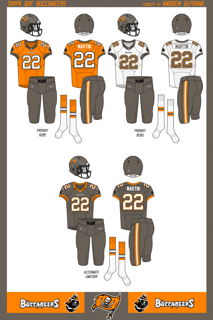
Too much black in the division already.
too many black jerseys in the league, period!!
I'm terrible at posting pictures from my phone. But hit that link up by far my favorite fan uniform
JDub, you just won the internet. Those look fantastic...or as a few others have said...fly as F**K
Ruud and Cadillac ones look the best IMO. I've been all for a pewter Jersey for awoke as.long as its not straight pewter. I think just about anything along the lines of jdubs jerseys would be awesome. Some stuff I'd tweak a little but the basic idea is great.
I think pewter jerseys could work, but only if we change to an actual pewter color....which is medium grey like the Pro Bowl jerseys. The doo doo brown we use now is more of a bronze and it doesn't work well with orange or red.
Might need to go back to red helmets or even orange if we went with pewter jerseys. A matte orange helmet with a glossy orange Buccaneer logo would be pretty sick,.
That mock up is incredible JDub
Here were some mockups I saw that I REALLY liked. There are just a couple changes that I'd make. I'd want a pewter jersey with white pants instead of pewter. I just don't like the all pewter look. For another alternate look, I'd have the orange with pewter pants and pewter helmet (but with Bucco Bruce on the side). You could also wear this look with white pants. This would allow the Bucs to still have kind of a throwback game. With the new NFL rules on wearing the same helmet for the whole year...the team would just have to swap stickers for a week. You also might have to tweak the colors of Bucco Bruce as this uniform has no red in it. They could either add in a hint of red (kind of the way they do now with the orange) or just change the red to black in the Bucco Bruce logo.This would give the Bucs 3 home options and then the standard away white on pewter or white on white. The home options would be the standard red, the pewter, and then orange once a year for the throwback game. The only problem is that the Bucs wear white for half the year so really they only get to wear the red 3-4 times...so it might not make sense to have a 3rd or 4th jersey.
Might need to go back to red helmets or even orange if we went with pewter jerseys. A matte orange helmet with a glossy orange Buccaneer logo would be pretty sick,.
That is sweet.
I really want orange or pewter jersey alternates, and a matte pewter helmet (like what Jax, Minnesota and Seattle have). Matte helmets would be sick!
....and a matte pewter helmet (like what Jax, Minnesota and Seattle have). Matte helmets would be sick!
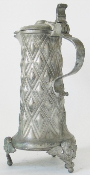
I agree 100%. Pewter is suppose to our thing that sets us apart, but we haven't got it quite right. Pewter is a easy to make metal alloy heavily used a few hundred years ago. It was mostly tin and almost always a dull matte finish and grey in color with hints of blue or green. Our "pewter" is more of a brown and our helmets are glittery like an old car with a metallic paint job. Our unis were so awesome when they came out 20 years ago and really got the fan base hyped and ushered in a new era of Buccaneer football. It feels like we could use another revamp and it makes too much sense for us to have matte pewter helmets for it not to happen.If they can make helmets that look like aged leather, then I am sure they can make a helmet that appears to be actual pewter. Actual Pewter...


 Our "pewter"....
I like the orange on the throwbacks, but not the new stuff. Pewter, red, and white all the way.
I like the orange on the throwbacks, but not the new stuff. Pewter, red, and white all the way.
I don't like the orange with the current pewter, but I think it goes great with grey. OSU has some great orange and grey unis. I think the bright orange highlights around the numbers, on the gloves, and shoes/socks, are needed to pop. Kinda how the Seahawks do with their neon green on thier grey unis. Otherwise it gets to blah and the NFL won't allow it.
The neon is what I hate about the Seahawks jerseys. Makes them look too college IMO. As for the orange and grey, I agree it's a good combo but to make that work you need to change the current logo to have an orange flag, which looks kind of silly to me.


