You're the Worst power rankings: NFL uniforms in 2015 by Matt Verderame 8h ago  Sep 3, 2015; Green Bay, WI The NFL logo on goal post padding prior to the game between the New Orleans Saints and Green Bay Packers at Lambeau Field. Green Bay won 38-10. Jeff Hanisch-USA TODAY SportsThe 2015 NFL uniform power rankings. It’s brutal.The 2015 National Football League season has given us some great football. We have seen a team go undefeated through the first 14 weeks of the campaign, something only done on three occasions in a 16-game schedule. We have Cam Newton and Tom Brady lighting it up, showing us why they should be considered for Most Valuable Player accolades.It has been a beautiful season if the love parity, with so many teams in the postseason race right until the last few weeks. Still, with only two weeks remaining, there are more than half the playoff spots unclaimed with so many franchises desperately trying to get into January football.However, there has also been the ugly side of the game. In this piece, we look at some of the worst NFL uniforms that were worn this year. There have been some devastating duds, with the NFL trying out this whole Color Rush scheme. A few of the uniforms have been alright, but none have been great and most are downright awful. It’s time to ditch the crazy looks, but the NFL loves it and that means it is getting jammed down our collective throats for years.Here are the 10 worst looks of the 2015 NFL season, as presented to you by FanSided editor Jonathan Bass and NFL Director Matt Verderame.
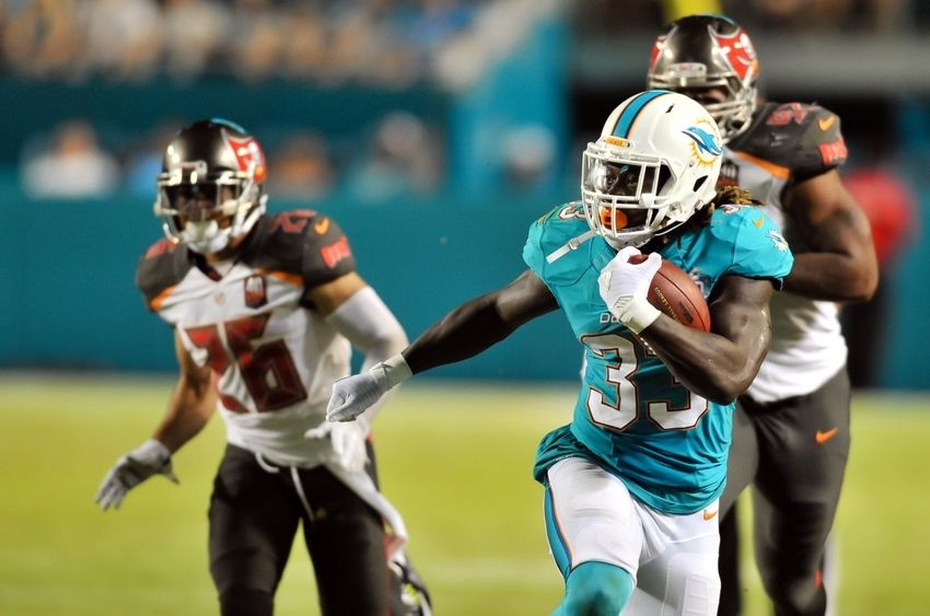 10. Miami Dolphins – Regular editionThe Miami Dolphins really did themselves in this year when they brought back retro jerseys from the 1966 season earlier this year against the New York Giants. Those were sleek. The lettering, the stripes on the shoulders, the old-school logo: all simply gorgeous. In fact the threads were so nice that they really hammered home just how bad Miami’s current uniforms are.Look, Miami is playing against a stacked deck. A dolphin is probably the least intimidating mascot in all of sports (though the Browns’ little Brownie the Elf might give Miami a strong fight). And team boasting teal, white and orange isn’t going to drum up much of a fear factor either. Really, the Dolphins should be selling themselves on nostalgia.Whatever the hell that new logo on the helmet is needs to go the way of the dodo. And it needed to happen yesterday. That streamlined Echo the Dolphin looking thing inside a burst of sunshine is an abomination. It’s hackney, childish and, frankly, an embarrassing feature to have on a National Football League helmet.The Dolphins are a tired franchise that is slowly losing the faith of what has always been a loyal fan base. Really, of all the franchises down in South Florida, the Dolphins are the only one with fans who stick it out through thick and thin. They need to drop all this new-wave s–t, go back to the uniforms of yesteryear, curry favor on the wings of nostalgia and at least give fans one small thing to enjoy. God knows the on-field product sucks; the team can at least look nice while playing poorly. – JB
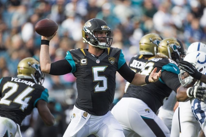 9. Jacksonville Jaguars – Regular editionThe Jacksonville Jaguars are playing better football these days, which somehow means that 5-9 is considered an improvement. Of course, it is hard to look away from the Jaguars, because they play in uniforms that look ridiculous. Jacksonville has this weird multi-color helmet that seems like it belongs on either a high school or mediocre college football team.Then again, the Jaguars have been playing on that level for most of the past decade, so it is fitting. The other problem is the pants. Why not just have a normal stripe? Stop trying to be cut for all 49 of your fans. Stop worrying about the stupid details on the pants and the cute little logo that says “JAGS” on the top. Dear God, do you really want people to know that you are the JAGS?Jacksonville had decent uniforms when it first came into existence back in 1995 when Mark Brunell, Jimmy Smith and Keenan McCardell were striking fear into the hearts of other teams. Now? The Jaguars simply look like a group of adults who had a few drinks too many and tried to look funny. If that is the goal, they have unfortunately succeeded without question. Please, stop the madness. – MV
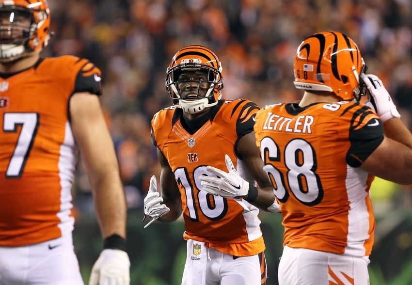 8. Cincinnati Bengals – Orange editionThe Cincinnati Bengals have always had a really hard time figuring out what the hell to wear. They are like that woman before a cocktail party, looking at a million different outfits in the closet before trying about 30 on, then realizing that the first one was probably the best choice.In the beginning, owner Paul Brown dressed the Bengals up to look just like his old team, the Cleveland Browns. The only difference was the helmet, which had “BENGALS” written across it in simple font. In 1981, the Bengals went from 0 miles per hour to about 450 MPH, putting stripes all over the uniform including the helmet.Currently, Cincinnati is rocking some of the ugliest uniforms in the business. If you are going to have orange on the uniform, it needs to be subtle. Apparently, the Bengals did not get the memo and are rolling out with all orange tops, something that can absolutely scare you to the core of your soul. The Bengals should go back to wearing black tops only and making sure that the pants cease with the idiotic striping. Just have some color down the side and be done with it. These are men, not 6-year-old kids. – MV
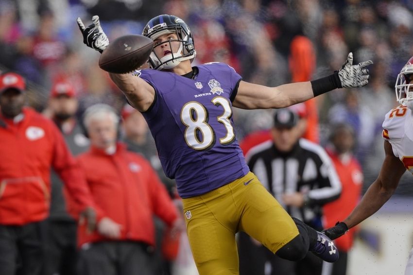 7. Baltimore Ravens – Gold pants editionHow in the hell did the NFL powers that be let these eye-sores take the field? How were these green-lit? Who conceptualized them? How many desks did these damn pants cross where they got the OK? They had to have been rubber-stamped, right?It’s only fitting that the Ravens wore these monstrosities at the end of a broken year. Just an ugly-looking, beaten down squad taking the field in absolute eyesore trousers. They’re supposed to be gold, but they look more like rust – just a non-sequitur to the entire franchise’s color scheme.And speaking of non-sequiturs, there is no continuity or flow between the pants and the jerseys. The black and purple stripes extend upward along the outseam of the legs, into total oblivion. There’s no continuation into the tops; just a dead end road – much like the team’s season. The “B” on the side also looks completely out of place. It adds to the already disjointed loon of the pants. A black and purple racing stripe with a roadblock three-quarters of the way up, that ends abruptly by falling off a cliff.If these pants were submitted on Project Runway, Heidi Klum would vomit on the floor and Nina Garcia would suggest the designer have his/her eyes get the Oedipus treatment, all while Tim Gunn lay curled up in the fetal position wondering where he went wrong as a mentor. The Ravens did not make it work. – JB
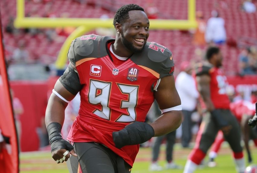 6. Tampa Bay Buccaneers – Regular editionThis specific subject has been pile-driven into the ground, but it bears repeating every three months or so: the Tampa Bay Buccaneers’ uniforms are flat-out terrible. In fact, that’s not even the best description. They’re childish. Is there something in the water down in Florida (other than bath salts and broken dreams), because all three NFL teams down there have childish looking unis.It is rather remarkable that the Bucs, with those hideous creamsicle uniforms from the 70s and Bucco Bruce on the helmet managed to find a more repulsive looking set of threads. It’s as if they went down to Roosevelt Elementary School and asked some of the young Rough Riders to draw what they think a uni should look like.Whether is was a group of seven-year olds or Banksy who designed the jerseys, it’s undeniable that the inspiration for the numbers was an 24-second clock. The pirate flag on the shoulders is tacky. The muted orange just below the shoulder pads is gaudy. And the multi-colored stripes on the legs look like the douchey flame tattoos some bros get on their forearms (looking at you, Josh Hamilton). As for the helmets, the logos are way too big and overtake the entire headpiece.It’s pretty incredible that the Bucs can land free agents, with players knowing they’re signing up to look like a timepiece at a high school gym. – JB
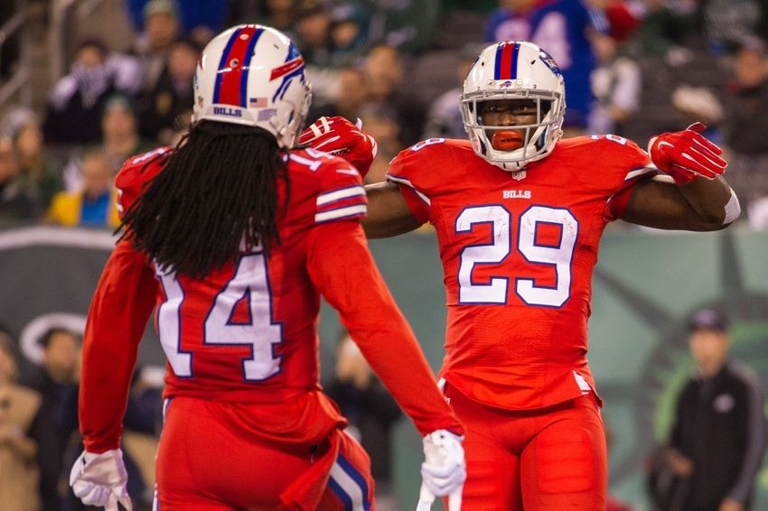 5. Buffalo Bills – TNF editionThe Buffalo Bills normally have pretty nice uniforms. Throughout their history, Buffalo has given us some of the nicest duds on the block, showcasing the standing buffalo on the helmet during most of the 1960s and some of the 1970s. It was a fashionable look that was clean and uncompromising, and it led to some great success in the American Football League with a pair of championships.Somehow, that was left behind but replaced by decent looks with the Jim Kelly-era appearance. Then there was the mess that involved all that piping when Drew Bledsoe was there, but the franchise got back on track a few years ago with the nice, new blue uniforms and a white helmet.Then, the Bills did it again. They screwed us with those awful Color Rush uniforms that the National Football League keeps trying to make work. Against the New York Jets, Buffalo rolled out with red tops and red pants, looking like either a bottle of ketchup or a weird Christmas decoration. It was one of the worst uniforms ever put forth and frankly, we all hit our knees at night hoping they never get worn again.The Bills have nice uniforms, but those were beyond ugly. – MV
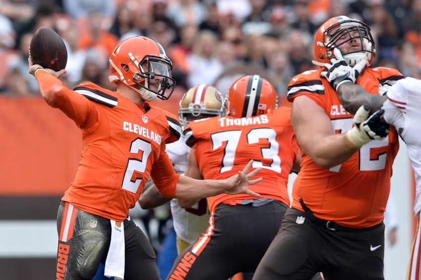 4. Cleveland Browns – General editionSome people really like the Cleveland Browns’ uniforms. In fact, it was a point of controversy in the office that these were even included. Good thing those schleps aren’t writing this article because they obviously have no sense of style.The best thing you can say about Cleveland’s uniforms is that they are the personification of life imitating art. A s–t team wearing s–t colored jerseys. There’s something artistic, really poetic, about that, right? Hell, this might be the first time that Cleveland has been associated with anything resembling art since Harvey Pekar passed away.But back to the jerseys. Cleveland should be forced to play all their games in the mud, because that’s where these trash heaps belong. Shoot, it might even give them a competitive advantage – camouflage!Get rid of the lettering on the front. You’re Cleveland. We know. The iconic helmets and complete lack of competency give it away.Toss all the alternate uniforms in the garbage can, pour gasoline over the top and light the sucker aflame. Dumb things down. Go back to the 1980s scheme with the wide stripes on the shoulders and no lettering. While we’re here, let’s get a little weird: remove names from the backs of jerseys – a la Penn State. Give yourself a real defining characteristic (you know, other than rebooting with a new coach and quarterback every two seasons). – JB
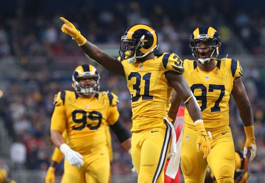 3. St. Louis Rams – TNF editionThe St. Louis Rams are pioneers in the uniform game. You may not have known this, but the Rams were the first team to ever paint logos on the side of their helmets. In fact, they were also the first team to wear colored uniforms, rolling with the gold tops and blue numerals. They were classy and different, and something to always be remembered.Fast forward to 2015, and the Rams have always kept it classy. St. Louis has enjoyed blue and god uniforms, after changing from blue and yellow in the 2000 season, right after winning the team’s only Super Bowl title. Then, on Thursday Night Football against the Tampa Bay Buccaneers, the world came crashing down. The Rams wore these hideous yellow tops with yellow pants, making it look like everybody on the team got drunk and urinated on themselves in zero gravity.There is nothing else to be said. These are one of the worst ideas ever concocted, and everybody involved should be fired. Who let these poor guys go out onto the field in front of all 349 fans like this? Those poor fellas deserve every penny this year. An outrage of the highest order! – MV
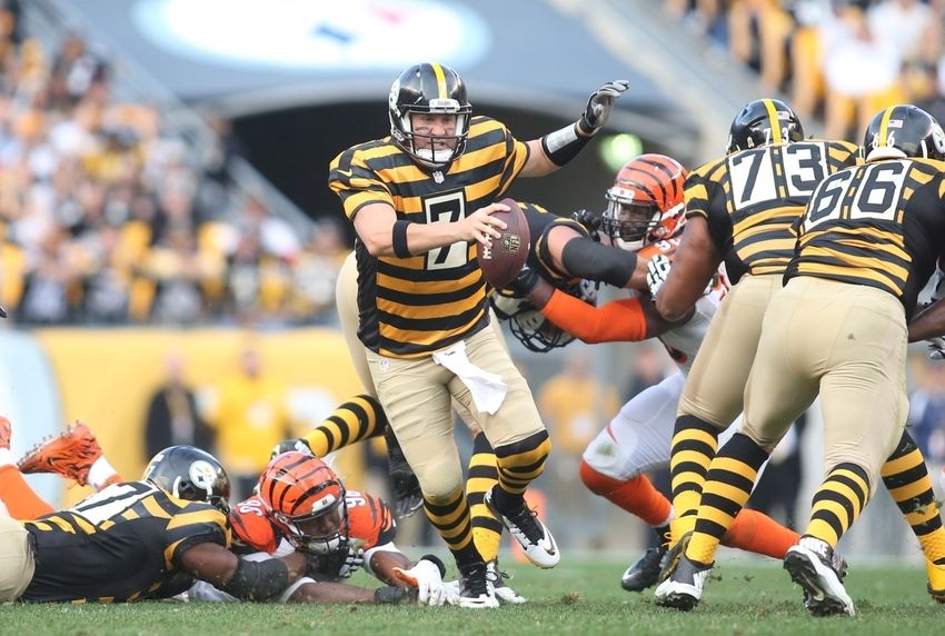 2. Pittsburgh Steelers – In Prison editionSticking with the prison theme here for a second: Given the league’s waning goodwill in the eyes of critics, shouldn’t they move away from anything that might move people to think about incarceration? Ben Roethlisberger will forever be tied to sexual assault charges, so him wearing this get-up seems a little mean-spirited.And speaking of mean-spirited: forcing a bunch of hulking human beings to wear horizontal stripes is downright cruel. Those things aren’t falttering. Why not just put “Fatty McGee” on the back of every jersey.Yeah yeah, some butthurt Steely McBeams are going to come out of the woodwork to talk about how these duds are an historic homage to the 1934 team. Well bravo, soldiers, the team went 2-10 that year. Way scrape the bottom of the barrel and prop it up. Shame the franchise doesn’t have any better years under its belt that can be celebrated …Pittsburgh’s look in the modern era of football is iconic. No need to dredge up ugliness from the past. – JB
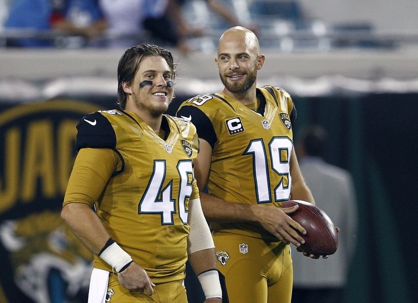 1. Jacksonville Jaguars – TNF editionYup, the Jacksonville Jaguars are back on the list and uglier than ever. This team just can’t figure out how to properly outfit 53 grown men. Maybe this is why the team has such a hard time attracting free agents who are worth a damn. Then again, maybe the stigma of having to tarp of the upper deck is not helping the cause. How about the losing seasons, or the fact the team has to play a home game in London every year? Or could it be the ridiculous helmets and the fact that Jacksonville is a dumpster fire of a city in a state filled with great places to live?Sorry Jaguars fans, it must be a very tough lot in life. Back to the main point.On Thursday Night Football this season against the Tennessee Titans, the Jaguars rolled out something that made them look like human mustard containers. How anybody could play well in these things, who the hell knows? Then again, the Titans barely missed out on this list during this game, thanks to looking like a bunch of very mediocre smurfs in their all blue attire.The AFC South should stop playing professional football. Or start. Either one would be just fantastic. – MV
ForumVisual Realm2023-04-26T12:12:17-04:00
Notifications
Clear all
The Red Board
1
Posts
1
Users
0
Reactions
276
Views
Topic starter
Posted : Dec. 23, 2015 3:24 am
