that flag in the picture looks different though...anyone nottice?
The '76-'82(?) was cool.The 'newer' version was too rigid, imo
Sorry....but Bruce is the worst NFL logo ever. Maybe the worst logo ever in any sport.
Agreed. I've never liked that logo.
This old Browns logo might be worse. Maybe.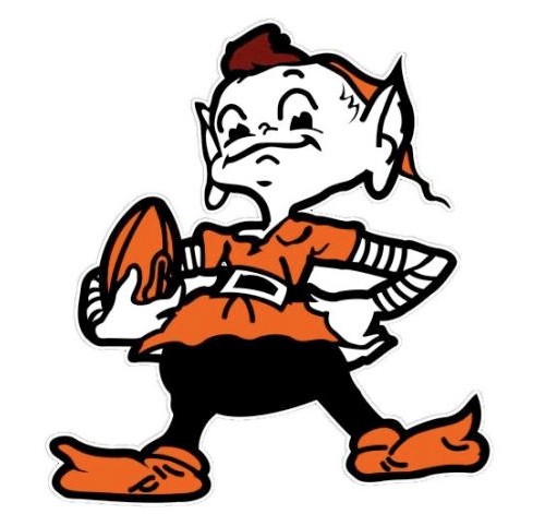
Browns need to use this and be done with it.
Browns need to use this and be done with it.
I really like that a lot.
Sorry....but Bruce is the worst NFL logo ever. Maybe the worst logo ever in any sport.
lmao.....c'mon, man!!
Nothing wrong with Bucco Bruce, people are just way too homophobic, lol. I don't get the wink in the original design though.
Nothing wrong with Bucco Bruce, people are just way too homophobic, lol. I don't get the wink in the original design though.
Haha, it's not about being homophobic, it's about the fact that it's ugly. The burnt orange is just hideous, and it clashes with the deep red. Plus, it's just silly looking. The skull and crossbones are iconic pirate symbols and just make more sense than some random guy.He should have done a portrait of Blackbeard or something. Pirates were badasses and there are some really awesome ones who could have made a great logo as a portrait caricature.Or just, ya know, a pirate ship.
 would love to see something like this...black helmet...chrome facemask and a red/orange logo
I can't believe the photos haven't been leaked yet. Nike has some loyal employees apparently.
I can't believe the photos haven't been leaked yet. Nike has some loyal employees apparently.
From what I heard, it's a major contract breach to release them early. I doubt anyone wants to get sued by Nike.
None of the other players are talking, which again leads me to believe that only a few people have had eyes on the new design.
 this would look really good with a chrome facemask and a touchup on the look of the logo...but the skull and crossbones is where it's at!
The Dolphins new logo was leaked immediately
