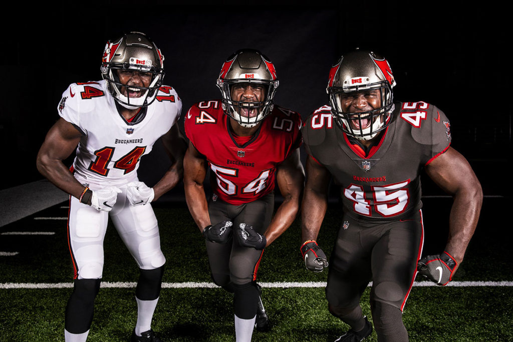
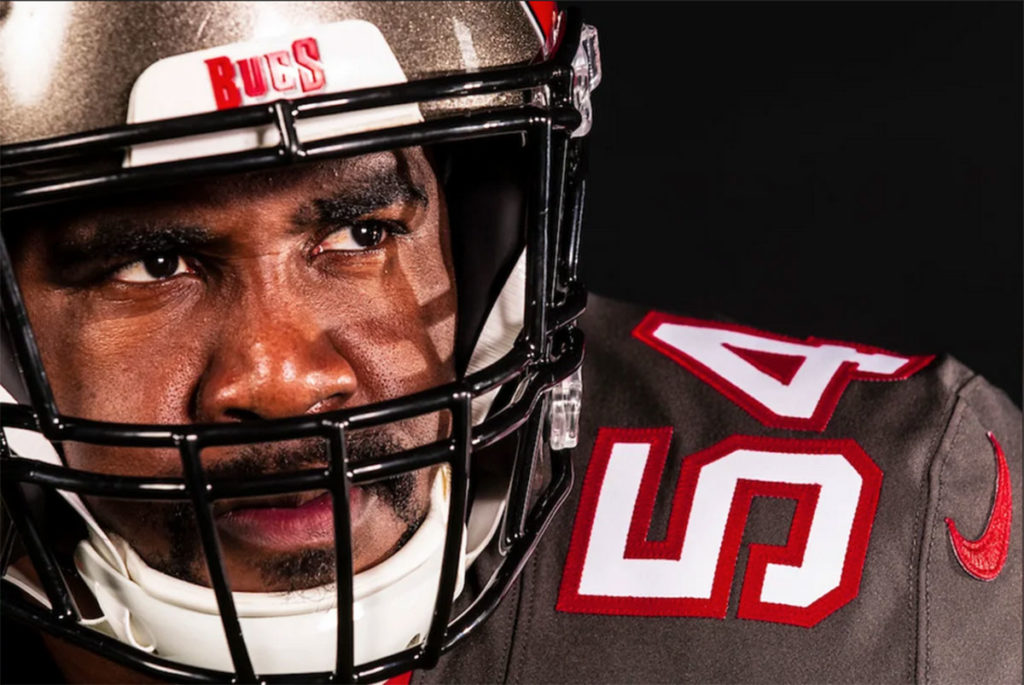
The Tampa Bay Buccaneers debuted their new Nike-designed uniforms on Tuesday via the team’s website and social media sites. The team kept their traditional red and pewter color concept – much to the chagrin of those Bucs fans that wanted a return to the creamsicle look the team had from 1976-1996 – and Tampa Bay’s red flag logo and pewter helmet remained intact. What is really new for 2020 was all-pewter look complete with a sharp alternate pewter jersey featuring white numbers with a red outline, and some matching pewter pants with white and red piping down the sides.
The Bucs had a dismal .354 winning percentage in the Nike-revised uniforms that the team debuted in 2014 and wore through the 2019 season. The team had an awful 2-14 record in those new uniforms under Lovie Smith’s first season in Tampa Bay in 2014, and the Bucs hope that their fortunes will change this time around, especially with future Hall of Fame quarterback Tom Brady wearing the updated ensemble in 2020.
So what does the Pewter Report staff think of Tampa Bay’s redesigned uniforms? Let’s get the thoughts from each Pewter Reporter.
Publisher Scott Reynolds
Tampa Bay’s new uniforms are a definite change for the better. The red and white jerseys and the pewter pants closely resemble the look from the Super Bowl era, and the Bucs were wise to make that move. They shouldn’t have tried to fix something that wasn’t broken in 2014, but at least they corrected their mistake and went back to a normal, classic-looking font for the numbers.

Bucs WR Chris Godwin – Photo courtesy of the Buccaneers
The best change the Bucs made in 2014 was the bigger, updated red flag logo. That remains intact, although slightly smaller now to fit on all helmet brands that the players use. The facemask has gone from chrome to black, as it was when the new red and pewter ensemble debuted in 1997.
But the best thing about these new uniforms is the all-pewter look with the alternate pewter jersey. Simply put, it’s bad-ass and quite the show-stopper. That’s my favorite look, followed by the red jerseys and the pewter pants that the team wore while winning Super Bowl XXXVII in 2002.
I was tipped off that the color pewter wasn’t going anywhere when the team announced that new jerseys were coming. Having a business called Pewter Report, a switch to the old creamsicles look would have been quite a challenge. Instead, the Bucs wisely went even more all-in on the unique pewter color.
It’s a job well done, Glazers, Nike and those in the Bucs organization that had a hand in the design. Maybe we’ll see the creamsicle look return for a throwback game next year, but it doesn’t deserve to be the prominent mainstay uniform for the Bucs anymore. All hail, the Pewter Pirates!
Editor-In-Chief Mark Cook
It is no secret I’m a traditionalist and miss the creamsicles. But I knew the odds of any orange or Bucco Bruce making any type of prominent return was very slim. In fact, the Glazers turned the page on that part of the franchise’s history in 1997 when they introduced the red and pewter scheme.

Super Bowl Bucs QB Brad Johnson – Photo by: Getty Images
With that said, the new updates are very good, and such an improvement over the ones we had to see the last six seasons. They are a tribute to the best and most successful period in the team’s history and fortunately the Glazers didn’t decide to go off the wall with any aspect of the newly designed uniforms. We have seen teams do that somewhat as of late. And yes, Titans I am pointing to you with your odd number font on the jerseys. Thankfully the new look is clean and crisp and a modern style, yet still traditional with a strong nod to the Bucs’ Super Bowl uniforms.
At the end of the day, what the uniform looks like means nothing. All the matters is the talent level of the players wearing them and the coaches who coach those players. That will be the deciding factor on Tampa Bay making the playoffs in 2020 – hello, Tom Brady.
Hats off to the Glazers for righting a very bad wrong. Good job with the new look.
Bucs Beat Writer Jon Ledyard
I LOVE the Bucs’ new uniforms, and I’m glad they kept the current logo and helmet intact.
Photo courtesy of the Buccaneers
The all-pewters are gorgeous. I love the fact that they changed the typeface of the jersey numbers from the awful alarm-clock style to this much more clean and traditional look. The all-pewter is a phenomenal choice, a perfect sleek alternate that is a simple, yet unique look.
I’m a fan of keeping the orange piping around the black lettering on the red jerseys. If you’re gonna combine orange and red, one of them has to be subtle, so this was perfectly done. The all-white kit might be my favorite. Either those or the pewters.
The Bucs hit the new uniforms out of the park. I’ll probably never love their red jerseys, but there’s not much I would critique about any of the new uniforms to be honest.
Bucs Beat Writer Matt Matera
I like these new Bucs uniforms and they are definitely an upgrade from the old ones. Each jersey sticks to one primary color with hints of secondary colors on the outlines of the numbers and pants. I think it’s important that they didn’t overdo it. The color scheme is simple, and that’s all it needed to be.
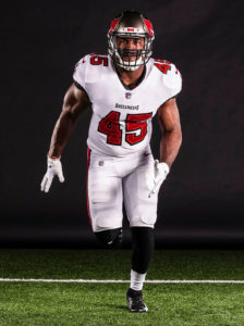
Bucs ILB Devin White – Photo courtesy of the Buccaneers
Admittedly, when I heard rumors of an all-pewter uniform, I was a little skeptical, but after seeing how they came out I have to say that I was thoroughly impressed with how it looked, and that’s not just a bias because of our website name – PewterReport.com.
The key to all three of the uniforms is that the numbers really pop off the jersey. The new numbers are way more easy on the eyes with the outline on the numbers also giving them a much better look. These have a semblance to the uniforms that the Bucs wore back in the late 1990s and early 2000s during their best era of football, so why not go back to their winning ways? I know there’s not that much creamsicle color, but that will be solved when they get that throwback game in a year from now.
If I had to rank them, I’d say the all-white away uniform is the best, closely followed by the all-pewter look, and then the red home jersey – but we’re really splitting hairs at that point. The Bucs did a good job with the new look.
Bucs Beat Writer Taylor “Grizz” Jenkins
Is it 2010 all over again, or do the Bucs’ uniforms just make it feel that way?
After the futuristic, digital experiment that was the Bucs’ last uniforms, they took a step back with an updated return to their Super Bowl-era threads, and they knocked it out of the park.
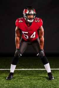
Bucs ILB Lavonte David – Photo courtesy of the Buccaneers
To start, the red uniforms are a great look. The updated writing on the chest, along with the newer editions of the ship and flag logo remaining on the shoulders and helmet, allow the uniform to feel like those of the past while keeping the best features of the uniforms that the Bucs have worn since 2014.
Next, the pewter color rush uniforms may be the best of the bunch. They’re bold, the white numbering pops off of the pewter base and the color isn’t bright enough to look overwhelming like I sometimes felt was the case with the Bucs’ red color rush uniforms. They will be able to wear their alternates up to three times in 2020, so I’d expect to see a few all-pewter prime time games in the Bucs’ future with Tom Brady under center.
As for the white uniforms, I’d optimally like to see them wear the pewter pants with the white jersey, but that’s not to say I don’t like them. It’s a clean look, but unfortunately it looks a bit too similar to Atlanta’s all-white uniforms for me.
All in all, after the way the last set of uniforms was received, Tampa Bay and Nike have absolutely righted the ship with their new set of uniforms and I can’t wait to see them on the field.
Scott Reynolds is in his 30th year of covering the Tampa Bay Buccaneers as the vice president, publisher and senior Bucs beat writer for PewterReport.com. Author of the popular SR's Fab 5 column on Fridays, Reynolds oversees web development and forges marketing partnerships for PewterReport.com in addition to his editorial duties. A graduate of Kansas State University in 1995, Reynolds spent six years giving back to the community as the defensive coordinator/defensive line coach for his sons' Pop Warner team, the South Pasco Predators. Reynolds can be reached at: [email protected]

